Color plays a crucial role in office interior design, going beyond mere aesthetics. It has a direct impact on the mood, productivity, and well-being of those working in the space.
The right colour combination for the office can create a positive and motivating atmosphere, fostering a more enjoyable and efficient work environment. From influencing emotions to affecting concentration levels, the importance of color in office design cannot be overstated.
In this blog, we’ll explore how incorporating modern color palettes can transform office spaces and contribute to a more vibrant and productive workplace.
Introduction To Modern Color Palettes And Their Impact On Workspace
Welcome to the cool world of colors in office interior design! Colors aren’t just for making things look pretty; they actually make a big difference in how we work and feel at work.
Imagine your office as a canvas filled with modern colors that are not just stylish but also super trendy. These colors are like the cool kids of the design world, making your office look awesome.
Now, let’s talk about why these colour combinations for offices matter. They can change our mood, make us more creative, and help us focus better. Picture walking into an office with calming blues or super bright yellows – it’s like a mood boost for your workday.
In this journey, we’ll explore the secrets of these modern colors and how they can make your office not just a place to work but a place that feels good and helps you get stuff done. Let’s dive into the world of colors and discover how they can make your office a better, happier space.
Understanding Color Psychology In Modern Office Design

Welcome to the world of colors and how they affect our feelings and actions! Modern color psychology is like a guidebook that helps us understand the vibes different colors bring to our lives.
Colors have this magical power to influence our emotions. Think about it – a bright yellow can make us feel cheerful, while a calm blue can help us relax. Understanding these color vibes is like having a superpower for creating the right atmosphere.
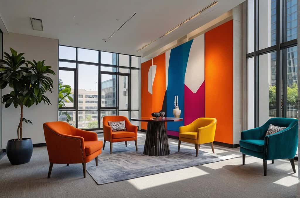
So, let’s break it down. Imagine colors as the superheroes of your office space. Some colors are energetic and lively, like reds and oranges, ready to boost excitement. Others, like greens and blues, are calm and collected, creating a soothing environment.
Let’s explore some modern colors and their associated psychological effects in office spaces:
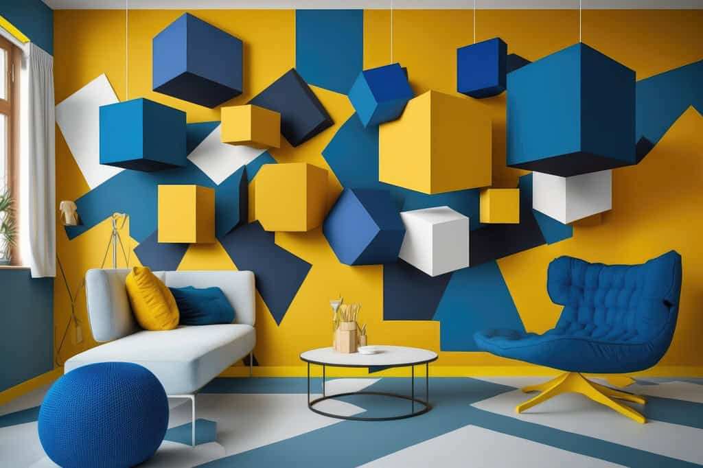
Cool Blues
Color Psychology: Blues are known to be calming and promote concentration. Lighter blues can create a serene atmosphere, while darker blues exude professionalism and stability.
Ideal Use: Ideal for spaces where focus and productivity are key, such as individual workspaces and office cabin design.
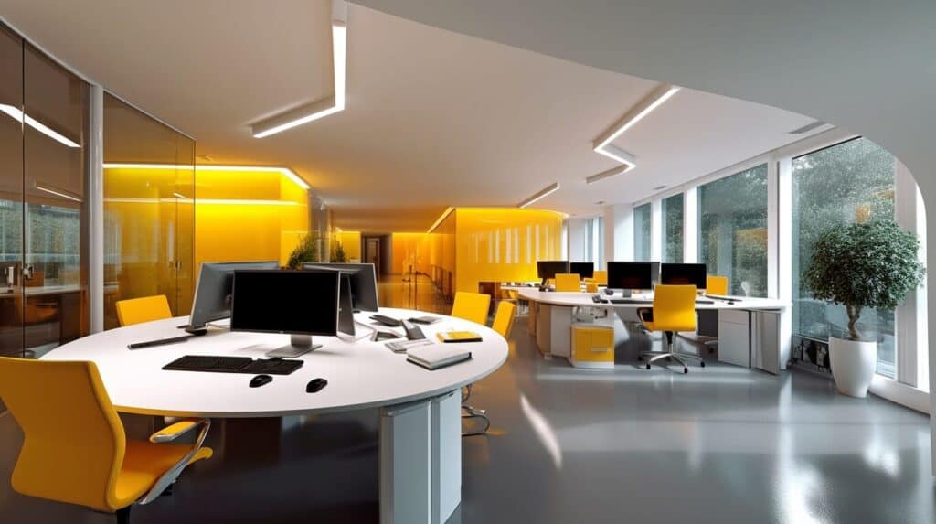
Energetic Yellows
Color Psychology: Yellows are associated with energy and positivity. They can enhance creativity and create a lively, optimistic atmosphere.
Ideal Use: Great for creative areas or spaces where collaboration and brainstorming are encouraged.
Fresh Greens
Color Psychology: Greens are linked to nature and balance. They promote a sense of calm and can reduce stress, making them suitable for creating a refreshing and harmonious work environment.
Ideal Use: Perfect for break areas or spaces where employees need to recharge.
Professional Grays
Color Psychology: Grays are neutral and sophisticated. Lighter grays convey a sense of openness, while darker grays can add a touch of formality.
Ideal Use: Suitable for creating a modern and professional look in common areas or individual workspaces.
Bold Reds:
Color Psychology: Reds are attention-grabbing and stimulate energy. They can boost motivation and intensity.
Ideal Use: Use red as an accent color in areas where you want to draw attention or inspire passion, but be mindful not to overpower the space.
Tranquil Teals:
Color Psychology: Teal combines the calming effects of blue with the rejuvenating qualities of green. It promotes a sense of tranquility and balance.
Ideal Use: Suitable for creating a peaceful atmosphere in meeting rooms or relaxation areas.
Remember, the key is to find a balance that suits your office wall colour. Combining these colors thoughtfully can lead to a workspace that not only looks modern but also supports the well-being and productivity of your team.
Also Read:- Pick The Best Wall Paint Color For Your Office Wall Designs
Trending Modern Color Combination In Office Spaces
Biophilic Greens and Earth Tones: Colors: Moss Green, Olive, Terracotta
Inspired by nature, this colour combination for office brings the outdoors inside. Moss green provides a sense of tranquility, while olive adds a touch of sophistication.
Terracotta accents warm up the space, creating a harmonious and inviting atmosphere. This palette is excellent for promoting well-being and connection with the natural world.
Minimalistic Monochrome with Pops of Color: Colors: White, Light Gray, Accents of Teal or Mustard
A clean and simple base of white and light gray is complemented by pops of teal or mustard accents. This combination creates a modern office interior design look while injecting a subtle hint of color for visual interest. It maintains a sense of openness and sophistication, making it suitable for various office settings.
Soothing Blues and Soft Neutrals: Colors: Powder Blue, Soft Gray, Beige
This colour combination for office evokes a calm and tranquil environment. Powder blue promotes a sense of serenity, while soft gray and beige contribute to a neutral and soothing backdrop. It’s an ideal palette for spaces where focus and relaxation are equally important, such as individual workstations or breakout areas.
Sunset Hues: Colors: Coral, Peach, Muted Gold
Inspired by the warm tones of a sunset, this palette brings a sense of warmth and positivity to the office. Coral and peach create a vibrant yet comforting atmosphere, while muted gold accents add a touch of sophistication. This colour combination for office is perfect for spaces where creativity and a lively ambiance are encouraged.
High-Contrast Black and White with Greenery: Colors: Black, White, Accents of Greenery
A classic colour combination for office of black and white is given a modern twist with the addition of greenery accents. This creates a high-contrast, visually striking environment. The touch of greenery adds a natural element, promoting a sense of balance and vitality. It’s a timeless yet contemporary choice for dynamic office settings.
Urban Industrial Grays and Copper Accents: Colors: Charcoal Gray, Steel Gray, Copper
This colour combination for office embraces the industrial trend with shades of charcoal and steel gray. Copper accents add warmth and a touch of luxury to the cool tones, creating an urban and contemporary aesthetic. The contrast between the grays and copper provides a visually appealing and sophisticated atmosphere.
Soft Pastels with Muted Metallics: Colors: Soft Pink, Mint Green, Muted Gold or Silver
Soft pastels like pink and mint green are paired with muted metallics, either gold or silver. This colour combination for office strikes a balance between playfulness and sophistication. The pastels bring a gentle and calming vibe, while the muted metallics add a touch of glamour and modernity.
Oceanic Blues and Coral Accents: Colors: Deep Navy Blue, Turquoise, Coral
Inspired by the ocean, this colour combination for the office features deep navy blue and turquoise for a cool and refreshing base. Coral accents bring in a pop of energy and vibrancy. The overall palette creates a balanced and invigorating atmosphere, making it suitable for collaborative and creative spaces.
Warm Neutrals with Burnt Orange: Colors: Warm Beige, Taupe, Burnt Orange
Warm neutrals like beige and taupe set a cozy and inviting tone, while burnt orange accents inject energy and warmth. This colour combination for the office creates a comfortable and welcoming environment, making it ideal for communal areas and shared workspaces.
High-Energy Red and Charcoal Gray: Colors: Bold Red, Charcoal Gray, White
A daring colour combination for an office of bold red and charcoal gray creates a high-energy and impactful atmosphere. White is used to balance the intensity and add brightness. This palette is suitable for areas where a dynamic and inspiring environment is desired, such as collaborative zones or areas meant for quick creative sessions.
These colour combinations for offices offer a mix of styles and moods, allowing you to choose the one that best aligns with your office’s personality and objectives.
You Can Create Colour Combination For Office with Officebanao
If you want to transform your office into a creative office room design, you can rely on Officebanao’s office interior designer. They are the best luxury modern office interior design company.
We have developed our own technology and gained extensive experience in creating contemporary office wall design. Our focus is on providing tailor-made solutions for office interior design for small offices that match your brand identity and business goals.