Good office colour combination is Important as it directly affects the overall productivity of a Space. It refers to the careful selection of colours that fit well together to create a pleasant space. When chosen correctly, the right colours can affect teams’ moods and creativity.
For instance, calming colours like soft blues and greens can help reduce stress and promote a sense of peace. On the other hand, vibrant colours like red and orange can boost energy levels and inspire creativity.
Renovating your office space in 2023? Here are some amazing office colour Combinations for you!
Some Amazing Office Colour Combination
1. Nature-inspired Colour
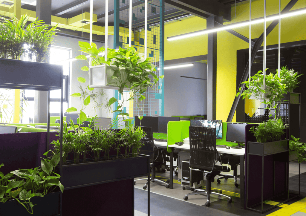
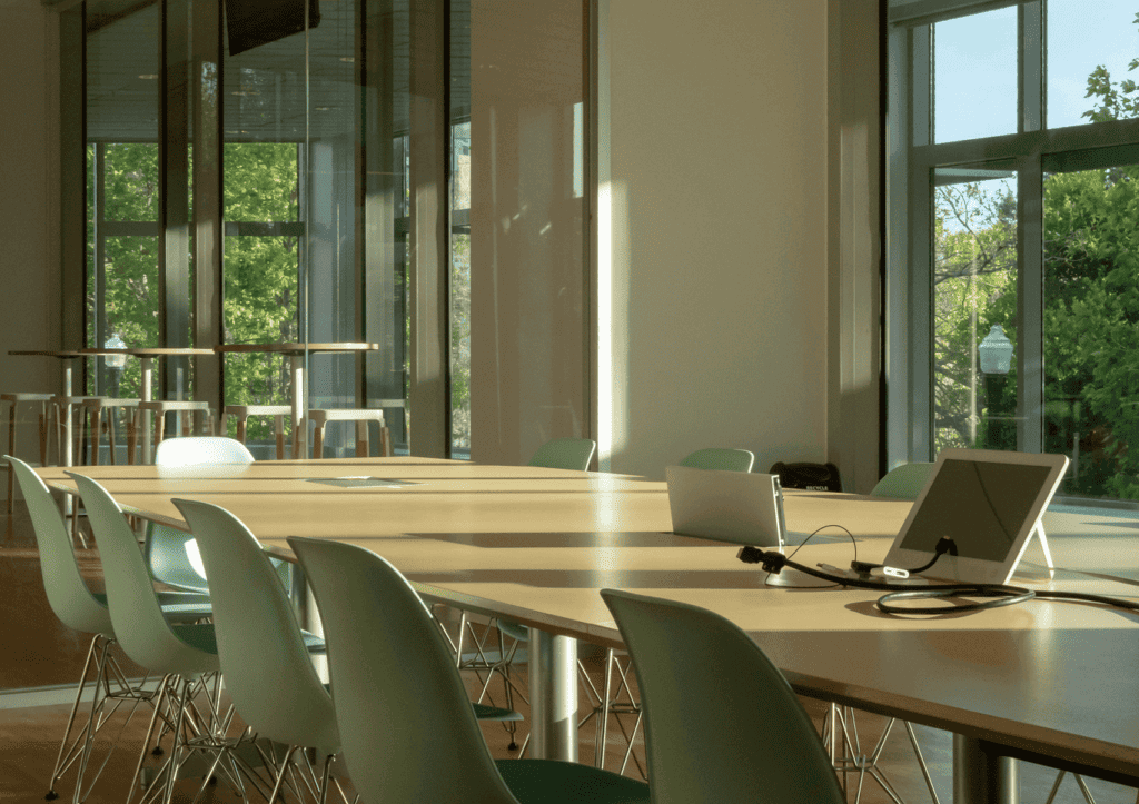
In this colour combination, we take inspiration from the colours found in nature. In the office, we use soft greens and blue colours, along with earthy tones, to create a peaceful space.
- Colour Combination: Soft greens and blues with earthy neutrals.
- Benefits: Creates a calm and relaxing atmosphere, helping team members feel at ease.
- Effect on Space: Encourages a peaceful and stress-free workspace, promoting focus and clarity.
- Ideas: Painting the walls of your office with a soft shade of green with shades of blue and green
Complementing these colours with natural wood tones for desks and shelves can further enhance the calming effect.
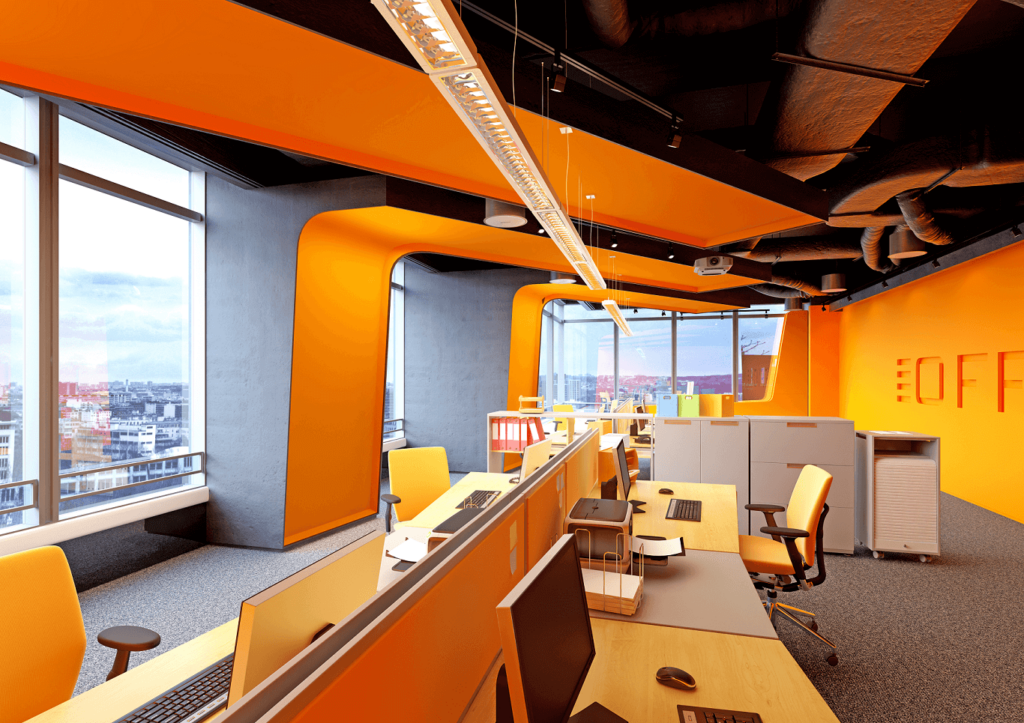
2. Energetic Office Wall Colour Combinations
Office wall colour combinations aim to infuse energy into the space.
- Office Colour Combination: Bold and bright office room colour combinations like red and orange.
- Benefits: Gives energy and enthusiasm, boosting motivation and creativity in the office space.
- Effect on Space: Adds a sense of excitement and Strength, making the office lively and engaging.
- Energetic colours: In the office, we use an Energetic colour by using bold and bright colours like red and orange. We painted vibrant walls and displayed lively artwork in the space.
Also Read: 10 Amazing Office Wall Designs
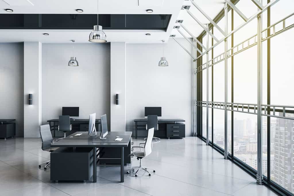
3. Monochrome Colour Scheme
Monochrome means sticking to a colour scheme that revolves around different tones of gray, along with black and white. The idea is to keep the colours simple and elegant, avoiding bright or bold hues.
- Office Colour Combination: Various shades of gray, black, and white.
- Benefits: Creates a sleek and sophisticated look, conveying professionalism.
- Effect on Space: Generate a sense of elegance and simplicity, promoting a focused and organized ambience.
- Modern Monochrome: The workspace looks high-end and professional with gray walls, black furniture, and white tones.
4. Simple Colours Scheme
Enjoy colours like whites, beiges, and light grays to reduce problems and create a good space
- Office Colour Combination: Whites, beiges, and light grays.
- Benefits: Embraces simplicity, reducing distractions and promoting clarity.
- Effect on Space: Fosters a serene and uncluttered space, enhancing productivity and concentration.
Examples: The office uses simple and clean office interior design ideas elements. Keep furniture to a minimum.
To create a calm space, use neutral colours like whites, beiges, and light grays on the walls and furniture.
Strategically placing plants adds a touch of nature and brings a sense of tranquillity to the space.
5. Pastels Colours Scheme
Using soft pastel Colours such as mint, blush, and lavender to create a calming environment that enhances focus.
- Office Colour Combination: Soft pastel hues like mint, blush, and lavender.
- Benefits: Inspires a calming and uplifting Space, enhancing focus.
- Effect on Space: Promotes a positive and soothing atmosphere, encouraging creative thinking.
Examples: In the office, we use pastel colours to create a calming and uplifting atmosphere, actively enhancing productivity.
We choose soft mint green walls to promote a sense of tranquillity and reduce stress among employees. The pastel pink and lavender accents on the furniture add a touch of cheerfulness to the workspace. The use of pastel shades on the office helps in increasing focus, as it creates a pleasant space for team members.
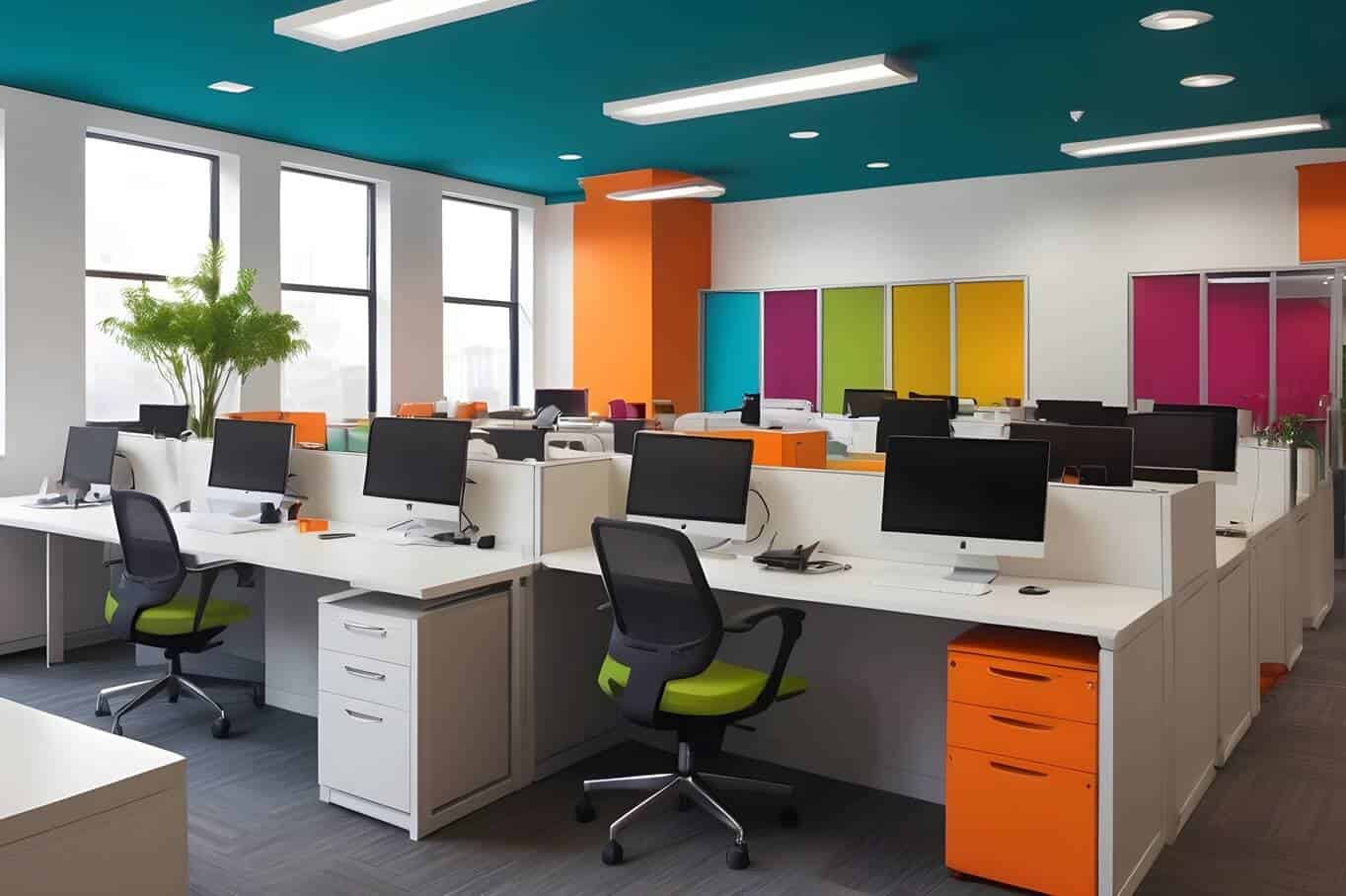
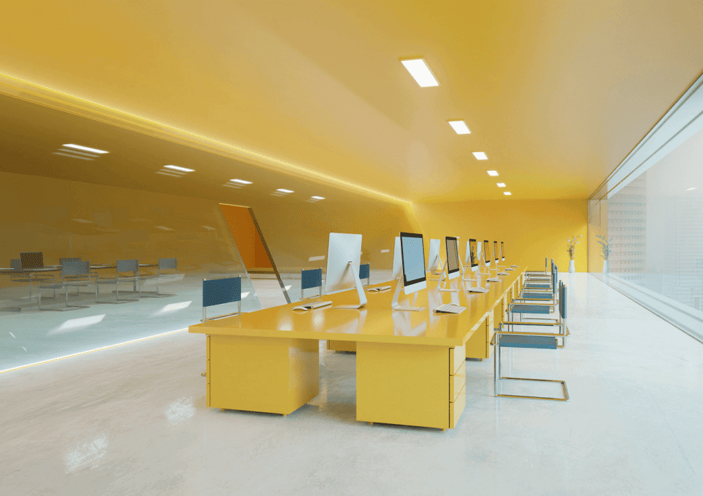
6. Bold Colours Scheme
Including bright office room colour combinations like teal, and mustard, as all the Bold neutral tones add excitement.
- Office Colour Combination: Vibrant colours like teal, mustard, or coral against neutrals.
- Benefits: Adds excitement and creativity, breaking the monotony.
- Effect on Space: Creates a dynamic and energetic workspace, boosting team morale.
Examples of Bold Colours: In the cabin or common areas, we use bright walls to create a bright space.
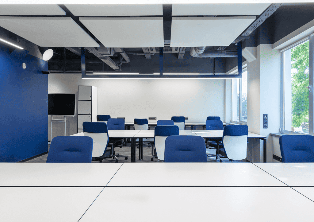
7. Timeless Blues and Whites
Pairing classic blue with crisp whites to convey a sense of trust, reliability, and expertise.
- Office Colour Combination: Classic blue paired with crisp whites.
- Benefits: It Generates a sense of trust and reliability, creating a professional setting.
- Effect on Space: Enhances a sense of stability and confidence, fostering teamwork
Examples: In the office wall Colour Combination, we can use blues and whites to create a sense of trust and reliability. For example:
The workspace features desks and cabinets finished in crisp white, creating a clean and professional appearance.
The company provides employees with blue and white ergonomic chairs, ensuring comfort and support throughout the workday.
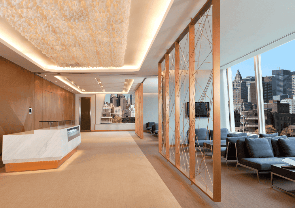
8. Rustic Warmth
Using warm tones like terracotta, ochre, and deep browns to create a cozy and welcoming atmosphere.
- Office Colour Combination: Warm tones like terracotta, ochre, and deep browns.
- Benefits: Provides a cozy and welcoming atmosphere, increasing comfort.
- Effect on Space: Encourages a sense of togetherness among team members.
Examples: To achieve this look, consider painting the walls in earthy or deep brown colour, instantly making the space with warmth.
Introduce wooden furniture with a distressed finish, opting for desks, chairs, shelves, and cabinets made from rustic materials like reclaimed wood.
9. Futuristic Neons office room colour combination
Using neon office room colour combination against a dark wall stands for innovation and creative thinking.
- Office Colour Combination: Neon accents against a dark background.
- Benefits: Represents innovation and creativity, stimulating imaginative thinking.
- Effect on Space: Creates a cutting-edge and futuristic vibe, inspiring out-of-the-box ideas.
Examples of Futuristic Neons: Picture a dark wall as the backdrop, creating a perfect canvas to showcase vibrant neon colours.
The main colour scheme would consist of brilliant hues such as neon pink, electric blue, fluorescent green, and radiant purple.
They will use strategically these neon colours throughout the space to evoke a sense of excitement and futuristic energy.
10. Fusion Office Colour Combination
- Office Colour Combination: Eclectic colours and patterns inspired by different cultures.
- Benefits: Celebrates diversity and uniqueness.
- Effect on Space: Encourages open-mindedness and collaboration, promoting a harmonious team spirit.

You can create office interior design ideas with Officebanao
If you are looking to change your office space into an inspiring Environment, Officebanao’s expert office interior designers are here to help. We have developed our own technology and gained extensive experience in creating contemporary and creative workspaces. Our focus is on providing tailor-made solutions that match your brand identity and business goals.