The world of design trends is fluid and forever in transition. In this ecosystem, staying on top of trends is paramount for design to stay relevant and on-point. Things aren’t any different in the world of office interiors.
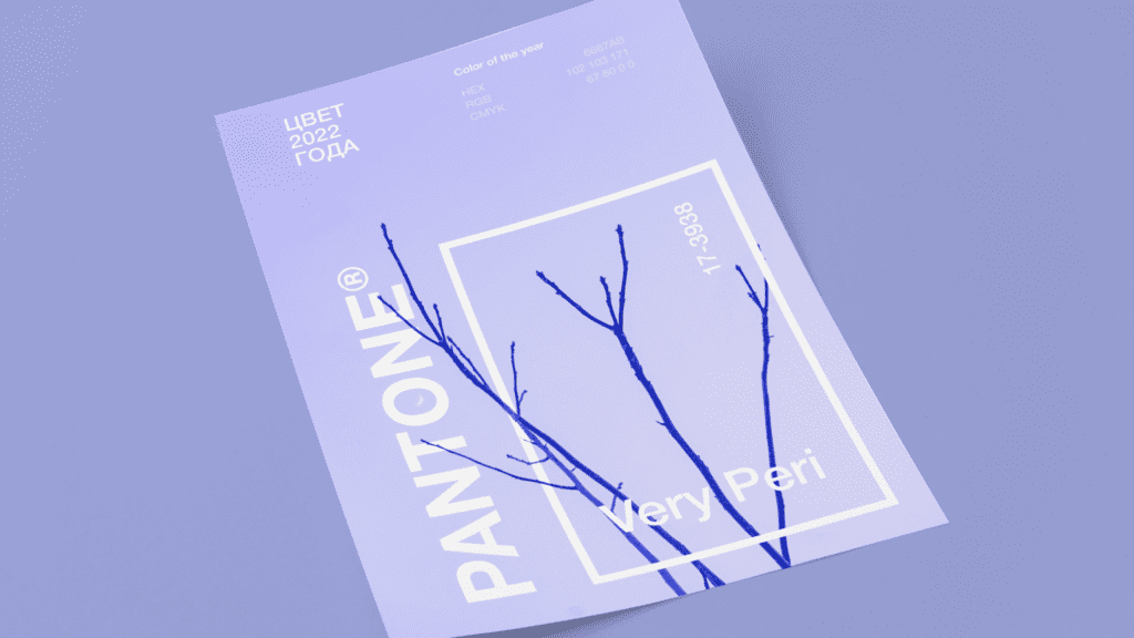
Thanks to the Pantone Matching System, designers don’t need to scurry through the abstractions of the Paris Fashion Week for the latest colour trends. Each year, the company announces a Colour of the Year that serves as the cornerstone for design palettes across disciplines. (wccannabis) The colour for this year – PANTONE17-3938 or Very Peri – stands for an altered landscape of possibilities emerging from the end of a period of isolation.
The Cloud Call office uses a bold contrast of Very Peri with dull hues
Very Peri exudes levity and vibrancy, so it’s not unusual to assume a restricted application in “creative” industries. The software company CloudCall shatters the stereotype by using a sharp contrast of Very Peri against dull greys. The carefully coordinated contrast ensures a sense of space while still representing the transitionary qualities of the Colour of the Year; still young, still vibrant, and totally relevant to the software industry.
Also Read: Best Colour Combination For Your Office
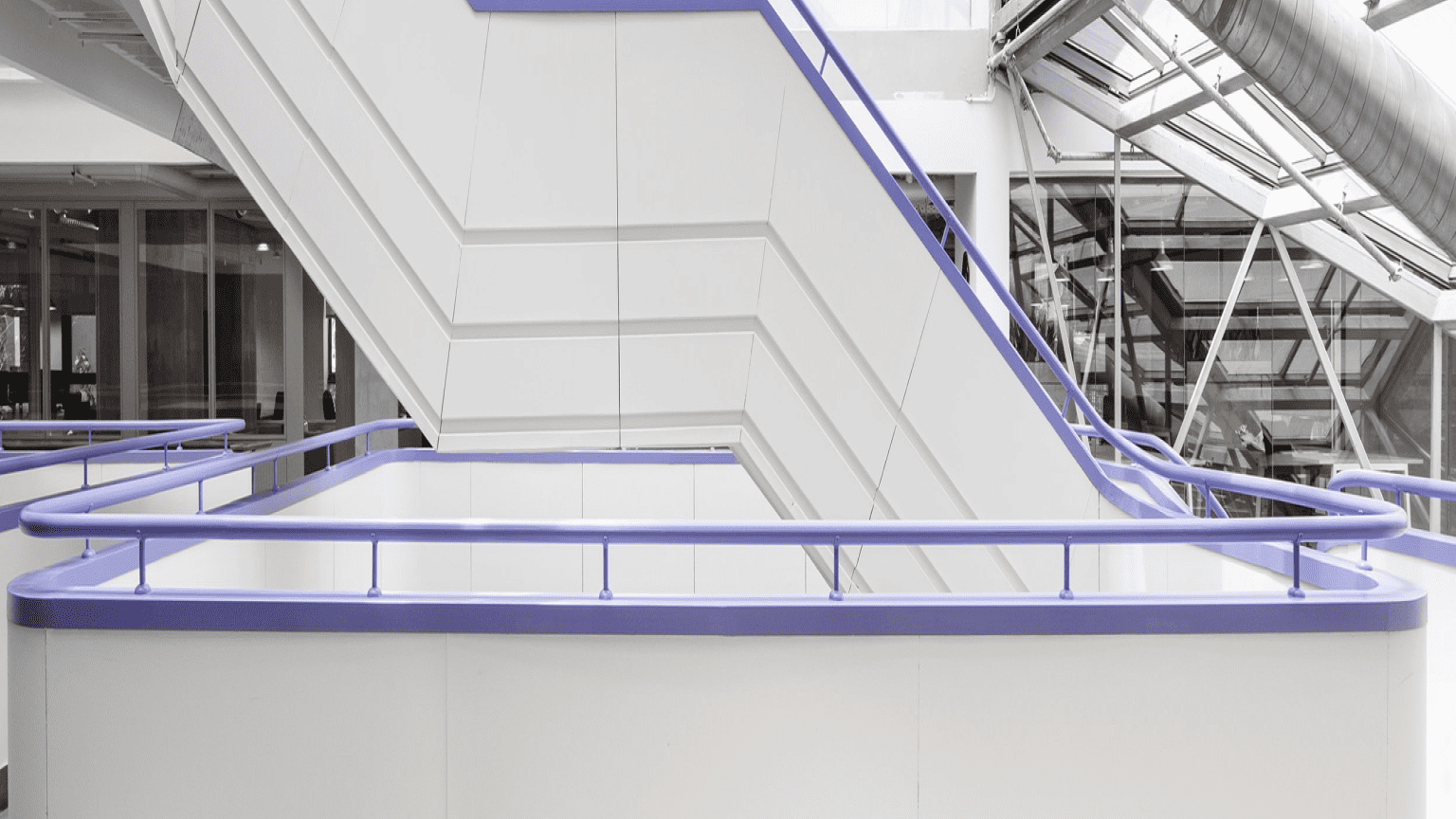
Joy Tunes Takes the Minimal Route with Frugally Used Very Peri Accents
The office of JoyTunes, a startup that develops apps for independent music learning, takes the opposite path with an emphasis on subtlety and minimalism. The frugally used Very Peri accents on railings and furniture take center stage against the otherwise stark colour scheme that complements the vibrant counterpart. Very Peri is used to highlighting the sharp, linear architecture of the space.
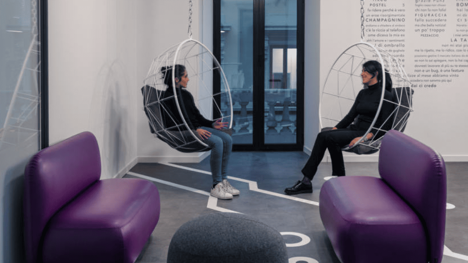
Prima Assicurazioni Goes Very Peri!
The Prima Assicurazioni goes all out to exhibit the versatility of the colour. The Milan-based vehicle insurance agency mixes it up, using Very Peri lighting and flooring in some parts of their office while using it just for upholstery in others. From in-your-face vibrancy to barely noticeable subtlety, the interiors unleash the full potential of the palette.
Inherently vibrant, young, and transformational, Very Peri depicts the fusion of modern lives with a digital reality – a direction that most office spaces are looking to head toward in the new age.